At the airport yesterday afternoon, after pulling our luggage off the arrival carousel, we decided we needed a bite to eat. What the heck… let’s get something at Burger King.
Divvying up our food items revealed the “Veg City Airport” themed artwork on the Burger King paper tray liner.
Burger King is using the airport security screening metaphor – blocking bad people from getting through the gates – as a way to convey that they (Burger King) similarly screen for only quality ingredients.
But what the hell is going on in this picture?
First I saw a nervous looking onion.
Then I noticed it had its pants down.
Then I noticed the angry pickle… and then the examination glove?!

It seems that the Onion depicted in this image isn’t a quality ingredient. Yikes.
The Onion is standing in the middle of the airport with his pants around his ankles while an angry, brawny “pickle” slips on a examination glove in preparation for a body cavity search.
I’ve got so many questions.
In addition to Botox and anti-aging cream (to make itself look fresher than it actually is and try to sneak into Burger King’s ingredients)… Look at the collection of articles airport Pickle security has dumped out of the Onion’s bags… (i.e. Burger King has allowed the artist to depict in the cartoon artwork).
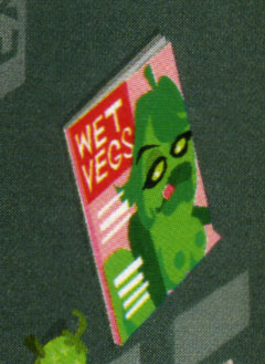
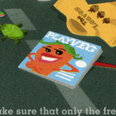
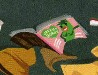
(I’ve zoomed in and flipped the images so they’d be easier to read)
“Wet Vegs” magazine? (featuring a topless large-breasted pickle licking her lips)
“Playveg” magazine… featuring a half-naked well-endowed carrot pepper.
And a copy of “Green and Horny” featuring a big-breasted, topless pickle.
I feel bad for the Onion. I get that it’s a “bad” vegetable… not the kind Burger King wants to serve… but this treatment is just humiliating.

Joking aside… is this the brand Burger King wants to be? The kind that features images of body cavity searches performed on an onion by a “Village People” pickle?

(notice resemblance to Village People character)
The artwork is part of a series called Veg City. There’s the Airport, Red Light District, Sniper, and two seasonal versions: New Year’s Eve and Halloween. These were created by the BBDO German agency called .start based in Munich, Germany. (Thanks Ads of the World for the links).
Please don’t misconstrue this post as supporting/creating “buzz” for a successful tactic by Burger King. (Unless, Burger King is positioning itself as the “Hooters” of fast food burgers). This Mad Magazine-style execution – while funny and clever – doesn’t fit the Burger King I’ve known.
What is Burger King thinking?
Update
Via email, I’ve met the artist who illustrated this project, Christoph Hoppenbrock. He is quite talented. You can take a look at his work at Bildbauer.de.