Compromise gets a bad rap in the United States. Departing with anything less than the biggest, the best, and the most reflects weakness.
Yet, since most of us work in an environment where different people come from different backgrounds with differing approaches on how to reach a similar goal – compromise is a reality.
There are times when you don’t need to win, but you do need diplomacy. You need “best possible.” To strike a balance. A happy medium. This situation calls for a Target Diagram!
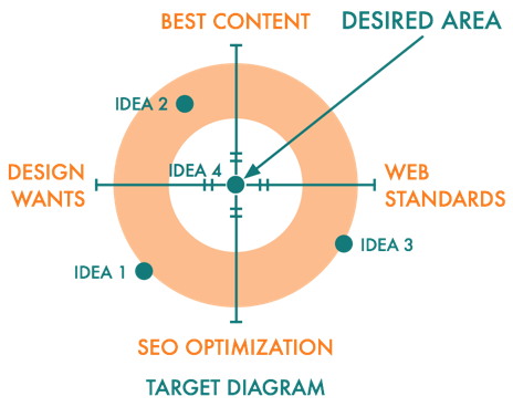
This graph is great for plotting something that falls within a realistic range of choices … The prime space between NONE and ALL. It is what you use when you need the right mix.
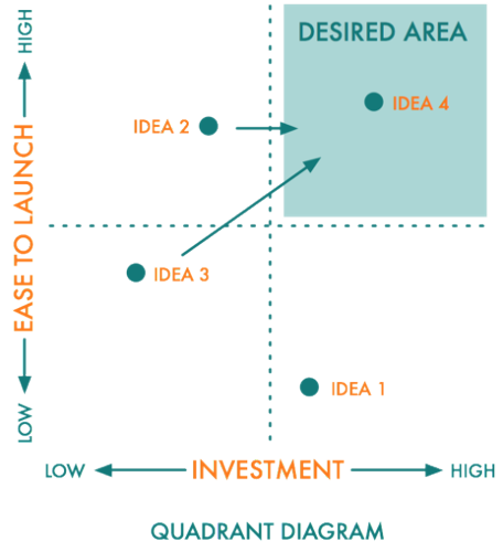
It is different from a Quadrant Diagram or “2×2” as it is sometimes called… The Quadrant Diagram categorizes the lows and highs of something. The quadrant is great when you’re pushing for the extreme. To maximize.

This is not that.
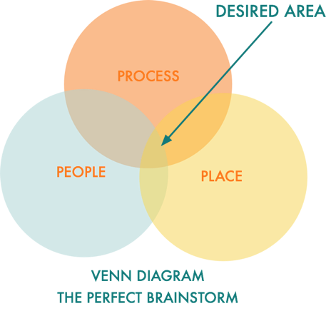
It is almost like a Venn diagram—where the two or three circles meet representing the perfect blend.

The target diagram is a great way to gauge you’re within established boundaries. Not too high or too low. The business equivalent of what Goldilocks was after at the Bear’s house—”just right.”
To try it, put your two sets of opposing forces at either end of the axes. In my example, I’m balancing website design between what we really want, and what we need to do to meet logistical needs. The goal is to find ideas that comes close to the middle of the target.
Next time your ideas need diplomacy, try graphing them on a target diagram.
This article was originally published on the Marketing Prof’s DailyFix website.

