Design Technique
If you want more people to visit your business, you’ve got to:
- let them know you’re there,
- pique their interest, and
- communicate clearly a compelling reason to enter.
Some essential tools that help achieve these goals include your exterior signage and presentation. Designing signage that is easy to read and understand at various distances helps alert a customer to who you are and what you do.
In this article we cover technical components related to effective signage design; this includes size, colors, and typeface. Check out our other article with a focus on Guide to Better Awareness Through Signage: Creating Great Messaging & Alluring Offers.
When a potential customer is considering doing business with you, everything they see and experience from your website to the curb of your location either contributes to or detracts from the decision whether or not to enter your business. Details from the paint color of your building, the cleanliness of your sidewalk, to your signage and in-window merchandising inform a customer whether your business is for them.
Signage & Message Type By Distance
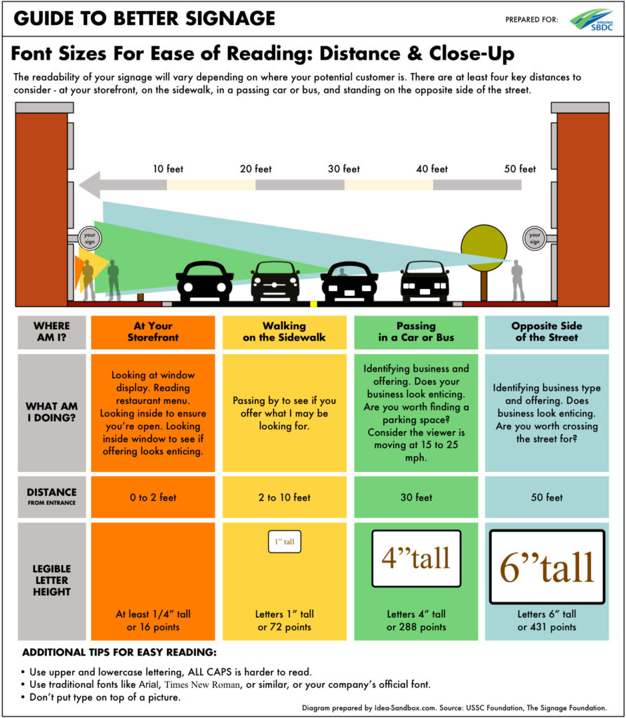
Customers learn about your shop – from the outside – in three distances. They see you:
Branding From Afar (10 to 100 feet)
From a block away, from a passing car or from across the street customers should see your company name and hopefully understand the type business you’re in (restaurant, retailer) and your offering (Italian restaurant, paper goods retailer).
Offers From The Sidewalk (5 to 10 feet)
Signage at this distance provides more specificity.
- The most authentic Italian food in town.
- Paper good supplies for home crafting with unique offerings for this season.
Details At Your Door (1 to 3 feet)
At the front of your shop, customers can stop and peer into your windows to see what products you offer, read your restaurant menu, or get a better understand of your pricing.
Thinking about signage this way helps us choose what to feature from what distance.
The graphic below provides some guidelines for crafting signage to be appropriate and effective at different distances.
Different types of signage should be designed to accomplish different tasks, and the messaging should reflect that.

Basic Technical Considerations
There are at least three basic concepts to consider to make sure your signage works. Is it a) visible, b) legible, and c) easy to understand?
A) Visibility
- Regardless of what is on your sign, can customers even see it?
- Size & Placement – Is your sign big enough and mounted in a conspicuous place to be seen?
- A flush-mounted sign works well to read from across the street or from a passing car. However, if permitted, should you also consider a blade sign that sticks out and can be seen from your sidewalk?
- Day & Night – Is it properly illuminated at night?
B) Legibility
- Readable Size – Is the lettering big and clear enough to be read from the appropriate distance?
- Readable Type – Is the type treatment simple and easy to read?
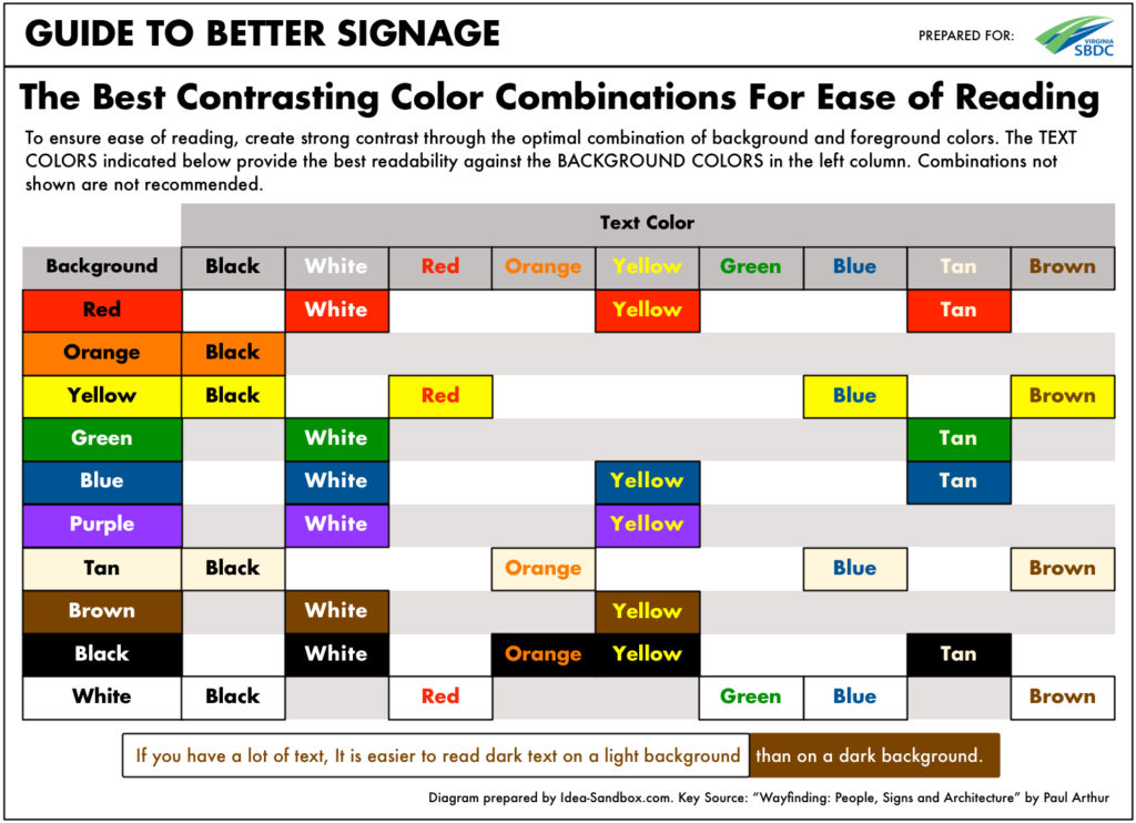
- Coloring – Does the color of the lettering and background work together to allow the message to stand out, but also be consistent with your brand?
The graphic below provides recommended color combinations that are easy to read, and even take into account color blindness.
A designer and signage shop can help you with these.
 C) Easy To Understand
- Is it clear from the name of your company what you do? Is there a piece of artwork or icon that represents what you do? (ice cream cone, shirt, wine bottle)
- If not, does your target audience at least understand what it is you do?
As an established brand, without showing a hamburger, we know golden arches represent a McDonald’s location, and that means burgers. The Apple Store doesn’t have any words on their signage, just their apple logo, we know what they’re about.
However, for Doug’s Travel or Samie’s Dog Depot, signage needs to provide some additional context. Does Doug book trips, sell suitcases or both? Is Samie a dog supply store, doggie daycare, or a restaurant serving gourmet hot dogs?
Now that we’ve discussed distance, size, legibility and understandability – let’s talk about other aspects
In-Window Merchandising: Let Your Products Tell The Story
Instead of telling customers via text on paper that you have “fresh seafood” or “tasty ice cream” show them! Fresh fish on display in the window. Smelling and seeing a fresh waffle cone being made. A mannequin seasonally well-dressed with matching handbag and shoes. These techniques allow you – in an appealing way – to showcase the quality of what you do. Furthermore, they contribute to impulse purchases. I hadn’t planned on ice cream tonight, but boy that smells good – I gotta have some!
Quality Out = Quality In
The quality of your presentation has a direct relationship to the amount customers may be willing to spend with you.
If you’re wondering why customers aren’t spending enough or as much as they used to – part of the problem may be that you aren’t making your business look like the kind of store worth shopping.
If signs appear old and worn, with bent corners, or information has been crossed out instead of reprinted; if your food or product photos are old and faded; these are all indicators that you’re cutting corners and not paying attention to detail. They’re signaling “lower quality.”
It makes customers think twice when you’re cutting corners with these highly visible things, and what other ways might you be cutting corners behind the scenes with your ingredients or products?
Be sure to make the best impression and pay attention to these and all the subtle details customers consider when choosing where to spend their money.
More Isn’t Better
Just because you have space, doesn’t mean you must use it. It is easy to get carried away over time. More signage, more messages isn’t better. In fact, it creates visual noise for your customers and can deter rather than attract customers.
A best practice is to de-clutter your messaging now. Take away non-essential messages and signage that detract from the essential things you need and want to communicate. And, next time you want to add a new message make it a requirement that you take an existing message away. This will help you avoid future clutter.
Not Sure What To Do? Follow The Big Brands
Sometimes it is easy to feel discouraged. How the heck can you compete with big brands who have budgets, research, and resources we can never afford?
All the research you need is available for FREE at the local mall or shopping district. You’ll see how 100s of brands have applied their research and efforts in signage, merchandising, product selection, and more.
You’ve got a camera on your phone – do some reconnaissance. No excuses!
In Closing
There is a lot to think about, plan and design when it comes to effective signage. But, none of it is rocket science. And it isn’t expensive. It just takes common sense and attention to detail.
Using these tips and techniques will ensure your business is seen, understood and considered as a quality place to do business.
